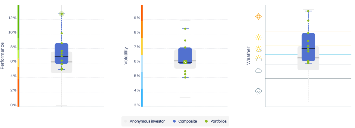

Composite Boxplots
This block visualises the distribution of the underlying portfolios of a composite, allowing users to assess not only the composite’s level, but also its dispersion, consistency, and outliers, across three dimensions:
Performance (returns)
Volatility
Weather (Perfometer score)
Blue boxplots represent the composite’s portfolios, while the grey boxplot in the background shows the Performance Watcher community for the same currency and risk level. This allows immediate comparison of the composite’s behaviour with that of its peers.
Each boxplot summarises the distribution of portfolios as follows:
Box (blue or grey)
The box spans from the first quartile (Q1) to the third quartile (Q3), enclosing the middle 50% of portfolios.Median (horizontal line inside the box)
The median portfolio, i.e. the central value of the distribution.Whiskers (lines extending above and below the box)
The whiskers delimit the range of non-outlier portfolios, as defined by the interquartile range (see methodology below).Dots
Each dot represents an individual portfolio.
Dots located beyond the whiskers correspond to outlier portfolios.
By comparing the blue composite boxplot with the grey community boxplot, users can visually assess:
whether the composite is above or below the community median,
whether its dispersion is tighter or wider than peers,
whether it contains unusually extreme portfolios.
A note on the Weather dimension
In the Weather panel, the boxplot shows the distribution of Perfometer scores across the composite's portfolios.
Unlike return or volatility, Weather is a derived, bounded metric that combines performance and risk into a single quality indicator. The boxplot, therefore, reflects the relative quality and consistency of management, rather than a raw numerical variable.
Dive deeper: how boundaries and outliers are defined
Why do we not assume normal distributions
Portfolio return and risk distributions are rarely normal. In practice, they may exhibit:
strong skewness (e.g. misclassified or exceptional portfolios),
fat tails,
very tight clustering (centralised or highly standardised management).
For this reason, Performance Watcher does not use percentile-based limits (such as 1%–99%) to define boxplot boundaries.
The IQR-based method
Whiskers are computed using the interquartile range (IQR):
[{IQR} = Q3 - Q1]
The boundaries are defined as:
Lower bound:
[Q1 - 1.5 x IQR]Upper bound:
[Q3 + 1.5 x IQR]
Portfolios outside these bounds are considered outliers.
This classical method has two key advantages:
It relies on the central 50% of the data, making it robust to extreme values;
It does not require any assumption about the shape of the distribution.
Relation to a normal distribution (for reference only)
If the data were normally distributed:
(Q1 ~ -0.6745𝝈)
(Q3 ~ +0.6745𝝈)
(IQR ~ 1.349𝝈)
This implies that the whiskers would be located at approximately:
Lower bound:
[Q1 - 1.5 x IQR ~ -2.70𝝈]Upper bound:
[Q3 + 1.5 x IQR ~ +2.70𝝈]
In a normal distribution, fewer than 1% of observations would lie beyond these limits.
This equivalence is provided purely as a reference — normality is not assumed in Performance Watcher.
Why not use a fixed 99% range?
Using fixed percentiles would implicitly assume that:
The distribution is stable,
tails are well-behaved,
Extreme observations are always meaningful.
Portfolio data rarely meet these conditions.
The IQR method instead adapts naturally to:
asymmetric distributions,
heterogeneous portfolio sets,
varying sample sizes.
Capped whiskers
An additional feature of the Performance Watcher boxplot is whisker capping:
If no portfolio exceeds the IQR-based boundary, the whisker is drawn at the worst or best observed portfolio, rather than at a theoretical limit.
This ensures that the boxplot remains a faithful visual summary of the data, without artificially extending the range where no outliers exist.
