
Monitoring of Alpha Generation
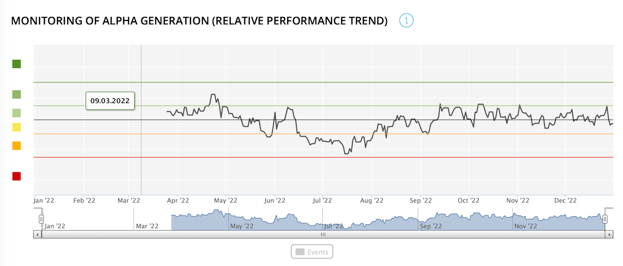
This graph shows the 3-month moving average of the portfolio's underperformance/outperformance relative to the selected index since the start of the selected period (3 months, current year, last year, entire period, other period).
The colour of the dots indicates whether the portfolio has underperformed (in red) or outperformed (in green) the selected index.
