
Peer Comparison
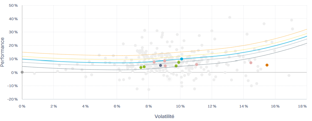
In the portfolio Analysis, this chart illustrates the green portfolio's position within its reference universe, defined by its currency and risk level pair, in a risk-return framework.
In composite Analysis, the green dots represent the portfolios in the composite as of the last date for the selected period.
A cloud of anonymised grey data points represents the community.
The benchmark, shown in blue, serves as an anchor for the weather lines (see below).
The pink dots, when available, represent strategy funds selected for the currency and risk-level pair.
Cash and equity markets are represented by the dark grey and orange dots.
Diving Deeper: Weather Lines explanation
The Weather lines show how an instrument's risk and return compare to its reference index.
Their shape adapts to the market regime:
In positive markets, instruments taking too little risk are slightly penalised (opportunity cost), while those taking too much risk are penalised exponentially. Around the index, Weather improves with better risk-adjusted returns.

In negative markets, instruments that preserve capital (lower risk and smaller losses) are rewarded, while excessive risk is again penalised. Around the index, Weather still favours better risk-adjusted returns, but gives more weight to capital protection.

In short, the Weather adjusts dynamically to market conditions—rewarding efficient risk-taking in up markets and prudent capital protection in down markets.
