

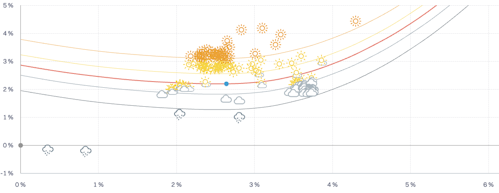
Peer Comparison
This chart illustrates the position of the selected instruments within their reference universe, defined by their currency and risk level, in a risk-return framework.
An anonymous scatter plot represents the community. The benchmark serves as a reference line passing through the risk-free return; hence, this slope represents the benchmark's Sharpe ratio. Any point below this line has a risk-adjusted return lower than the benchmark index in question.
The Peer Comparison chart allows you to see your selection in the context of the community it relates to, for the defined period, providing insights in an external context.
The Weather lines show how an instrument's risk and return compare to its reference index.
Their shape adapts to the market regime:
In positive markets, instruments taking too little risk are slightly penalised (opportunity cost), while those taking too much risk are penalised exponentially. Around the index, Weather improves with better risk-adjusted returns.
In negative markets, instruments that preserve capital (lower risk and smaller losses) are rewarded, while excessive risk is again penalised. Around the index, Weather still favours better risk-adjusted returns, but gives more weight to capital protection.
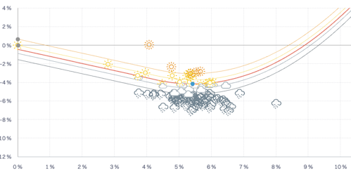
In short, the Weather adjusts dynamically to market conditions—rewarding efficient risk-taking in up markets and prudent capital protection in down markets.