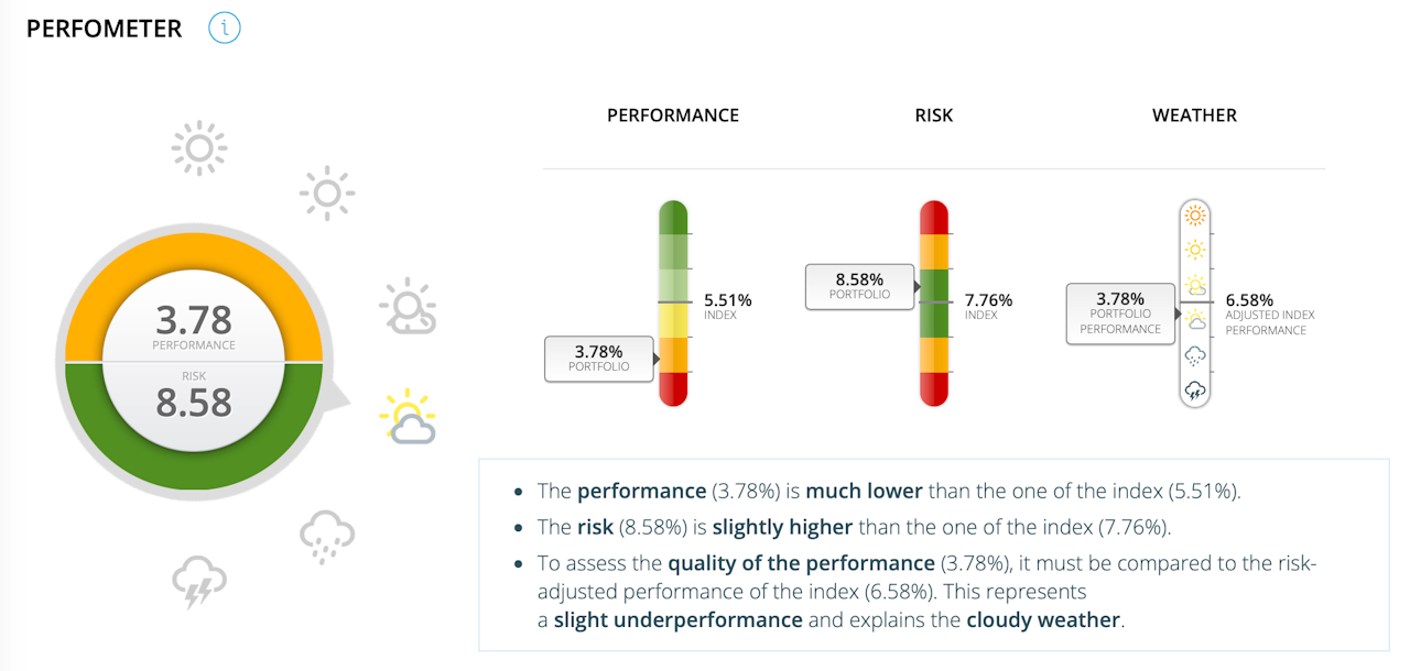

Perfometer
Performance:
The index's performance is represented by the median line (number on the right).
The performance of the selected portfolio is illustrated with a cursor positioned on the left. The higher the outperformance, the higher the cursor and the greener the colour. Conversely, the greater the underperformance, the lower the cursor and the redder the colour.
Risk :
The risk of the index is represented by the median line (number on the right).
The realised risk of the selected portfolio is illustrated with a cursor positioned on the left. The closer the realised risk is to the defined risk, the closer the slider will be to the median line and the greener it will be. Conversely, the further the realised risk is from the defined risk; the further the cursor will be from the median line and the redder the cursor.
Weather:
The median line represents the index's performance adjusted to reflect the realised risk of the selected portfolio ("adjusted index").
The performance of the selected portfolio is illustrated with a slider positioned on the left.
The greater the outperformance relative to the adjusted index, the higher the slider (sun). Conversely, the greater the underperformance relative to the adjusted index, the lower the cursor will be positioned (thunderstorm).
