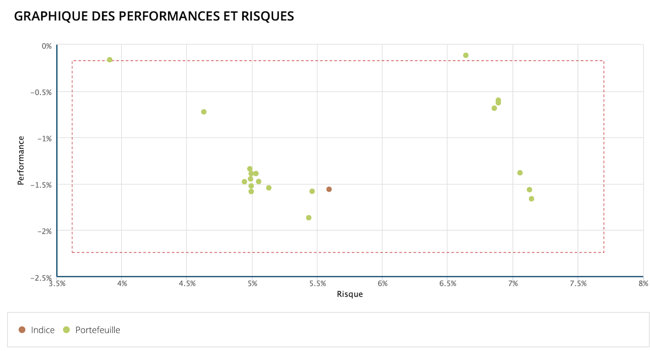

Performance and Risk Graph
The dots in a chart with Performance and Risk axes represent the portfolios and the benchmark composite index over the selected period.
The red box represents the limits beyond which the portfolios are excluded from the calculation of the composite. The limits are calculated at plus or minus 50% of risk and performance.
