
Risk Evolution
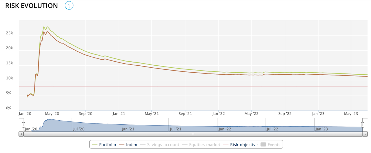
This graph shows how the portfolio's realised risk and the selected index have changed since the start of the period chosen.
The red horizontal line indicates the risk objective assigned to the portfolio.
The data appears from one month after the start of the period.
