
Risk Profile Monitoring
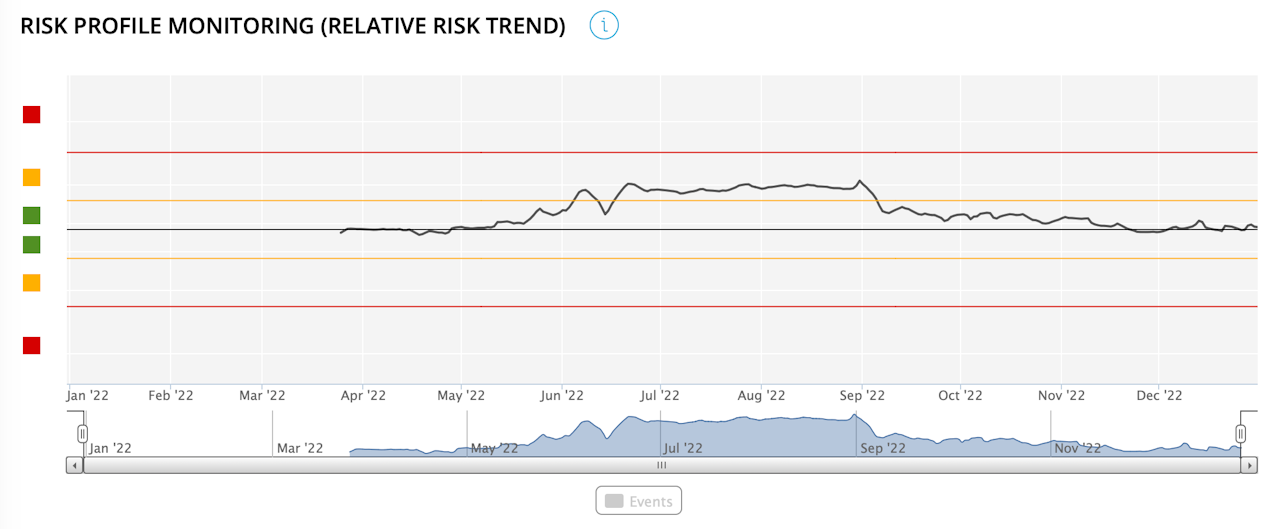
This graph shows the 3-month moving average of the realised risk level of the portfolio compared with that of the selected index since the start of the chosen period (3 months, current year, last year, entire period, other period).
The colour of the lines refers to the distance between the two levels of realised risk: red if the distance between the two risk levels is significant and green if the two risk levels are close.
