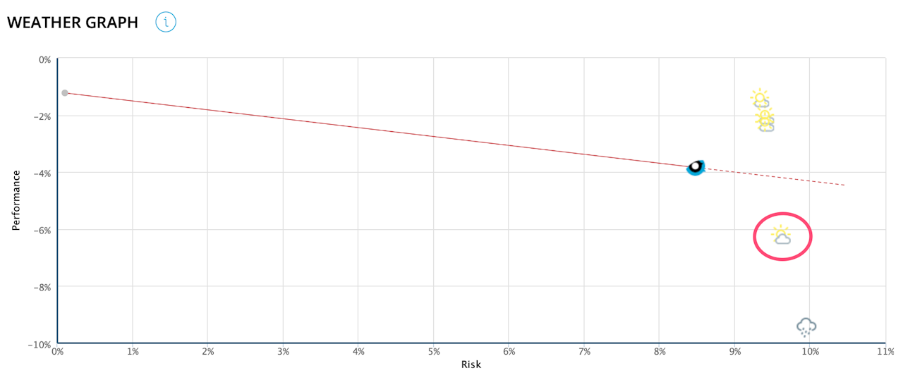

Weather Chart
In a risk/return framework, this graph shows the portfolios in the selected filter relative to the benchmark index corresponding to their chosen risk level.
The benchmark index represents either the corresponding PW index if there is only one currency and one risk level in all the portfolios selected or the world equity index,
Each portfolio is illustrated by a symbol representing the size of the risk-adjusted outperformance/underperformance, ranging from 'bright sunshine' to 'storm'.
The red line corresponds to the slope of the Sharpe ratio of the benchmark index (it only appears if all the sectioned portfolios are in the same currency).
