
Widget Plus
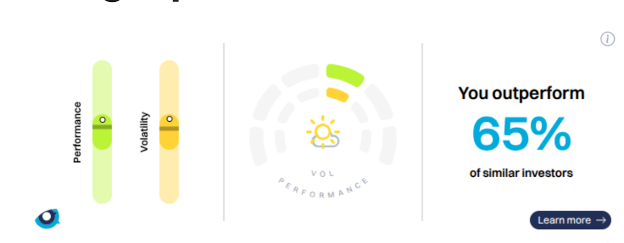
The Peer Group widget is a summarised view of the portfolio against the Performance Community. It has three sections
Stylised Boxplots of Performance and Volatility

Each boxplot shows in which quartiles the portfolio stands
The Performance boxplot displays the portfolios' performance, ranging from red to green, relative to the community.

The Volatility boxplot displays the portfolio's annualised volatility, ranging from ice blue to red hot.

The Performeter
The Perfometer consists of two semi-circular gauges, volatility and return, and a weather icon.

The outer gauge illustrates the performance of the selected portfolio, with red indicating poor performance and green indicating good performance. The centre, or midpoint, represents the index. Thus, if the outperformance is high, the indicator will be positioned on the right and will be green.
The inner gauge shows the index's volatility: blue indicates low risk and red indicates high risk, as shown when you hover over it. Midday is the reference point for the index, so any volatility below the index will be blue (cold) on the left, and any excess volatility will be red (hot) on the right.
In the centre is the Weather, with increasingly good weather showing good risk-adjusted performance and rainy weather showing possible improvements. A full explanation is available here.A percentile comparison
The portfolio is ranked against the peers, i.e. all the discretionary portfolios that have the same currency and risk level, and its percentile is displayed; the higher the number, the better the ranking.

